Visuals, layout, reader experience, and you
When I published my essay collection Even the Cemeteries Have Space Here, I made the layout choices very intentionally to create a sense of spaciousness for the reader. Shea in the Catskills contributed artwork that further deepened the reader's spacious and reflective experience. I was asked about an e-book version, but I declined to make one for this book, because the specific reading experience I wanted to create for this project was so connected to the physical book itself.
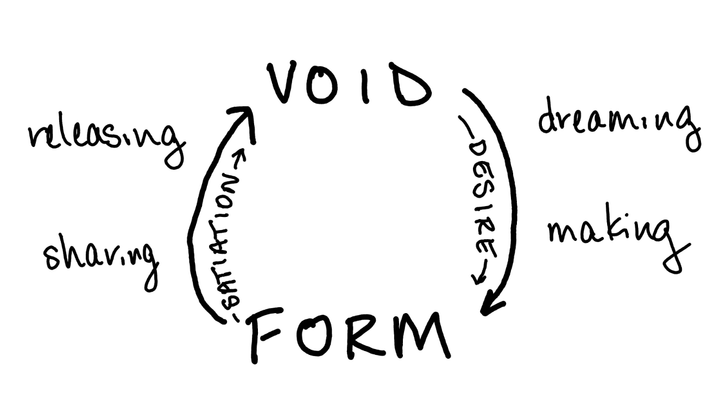
I think a lot about the fact that in electronic communication, my reader might encounter my work in very different ways than I imagined it going out in the world. I write on a laptop, black text on a white background, but they read on their phone in dark mode, a narrow column of white text on a black background. (I needed to take this into account when preparing the diagrams in an earlier post--I initially created them horizontally, then decided to switch them to vertical for easier reading on a phone. The outline is blue is because the image has a transparent background and the black lines weren't showing up on dark mode.) I may write in one font, but a reader's browser or email program might render it as something else.
We can't always control how people encounter the work we present via email or online, but we can always think about our own decisions about how we visually present and encounter our own writing. I think this is an especially important exploration for those of us who are writers without a visual creative practice of some kind.
✒️ Possible Explorations:
- Change the default font of your draft. Try out something truly outlandish! You could use Google Fonts to download a font you've never used before.
- Revise your work in a different layout than you wrote it. (I do this a lot!) For example, you could print it as two narrow columns on a horizontal sheet.
- Use a tool like Coolors to pick a color palette for your writing project. You could create a visual "logo" for the project using these colors and simple shapes in Canva. The logo could go at the top of the document or between sections so that it shapes your aesthetic experience of the piece.
🥑 Food for Thought:
- If you write a newsletter, how do you feel about the many different ways your reader might experience your writing (phone vs computer, light mode vs dark mode, possibly in a read-it-later app with its own font, etc)? Is this something you've thought about before? Do you think these contexts affect how the words themselves come across?