Three Steps to Asking Great Questions about Data — Even if You’re Not a Numbers Person
A secret about me is that I’m not originally a numbers person. I got good at understanding data because I thought it was important in order for me to think critically about the information I was given.
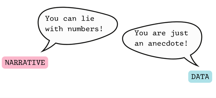
I hear many people say, “You can lie with numbers,” which is true. It’s also true that you can get a lot of useful meaning out of numbers.
I wrote this post particularly for those who are community advocates and who need to deal with data in order to do their advocacy on behalf of their communities.
I’ll use HIV epidemiology data for our examples, since I’m familiar with it—and also because I think this is an area where it’s very important for those with lived experience to be able to understand and ask critical questions about the numbers.
Because the truth is, while numbers are helpful, there can be all kinds of problems with them. Was it possible that some people were excluded or undercounted? Does the way the data was analyzed mask certain health inequities by lumping people together? (For example, analysis by gender that includes trans women and cis women in the same category may mask inequities caused by cissexism and transphobia.) What assumptions were made when designing the project and preparing the data?
These are all important things to keep in mind, but for today, let’s talk about three simple steps to take in order to ask good questions about data.
Make sure you’re oriented to the chart or table
The first thing you want to do is to make sure you’re completely oriented to the chart or table that you’ve been presented with.
If it’s a chart, you want to make sure that you’ve looked at the x-axis (horizontal) and the y-axis (vertical). Make sure you understand what is on each axis, including the units and the scale. Check on whether each axis starts at zero or somewhere else. If the axis doesn’t start at zero (for example, if the axis only goes from 90% to 100%, so it focuses on a small difference), ask yourself why that is. Was this an appropriate choice in order to display the data, or was the intent to try to make a difference look bigger than it is in reality? For charts displaying a percentage, check on whether the top of the axis is 100% (sometimes the axis will auto-set to 110% or higher, which can make the percentage bars look smaller than in reality.
If it’s a table, you’ll want to take some time to look at the vertical column headers and the row labels. Pay particular attention to making sure you understand any percentages. Sometimes the percentages presented are horizontal (they add up across the row) while other times, the percentages presented are vertical (they add up vertically within a section of the table). If you’re not sure, you can look at the percentages and see in which direction they add to 100%. Make sure you can describe in words what the table is showing, for example, “This table shows the percentage of people living with HIV who are virally unsuppressed, broken out by race/ethnicity,” or, for a different table, “This table shows the percentage of people who are virally unsuppressed who belong to each racial/ethnic group.”
Note how the two sentences above have basically the same key words (people who are virally unsuppressed, racial/ethnic groups) but they are not the same table. The first would tell you the proportion of people who are virally unsuppressed within each racial/ethnic group—this would be a helpful way to look at health inequities, since if there were no health inequity, the proportion of those virally unsuppressed within each group would be the same. The second would tell you the proportion of those who are unsuppressed who belong to each racial/ethnic group—this might be helpful for descriptive purposes or program planning. You could also use this to see if there are health inequities around viral suppression by seeing if the proportions of those who are unsuppressed are the same as the proportions of those living with HIV, but it wouldn’t be as easy to see any inequities as it would be with the first table.
Imagine what you’d expect the numbers to look like
Your next step is to forget the numbers in the table.
Now that you understand fully what the chart or table is trying to show, ask yourself what you’d expect the data in the chart or table to look like, based on your knowledge of the topic or your lived experience.
For example, if a chart were showing mortality (deaths) by age group, we would not expect all the bars to be the same length. We would expect to see more deaths in the older age groups.
If a chart is showing the same outcome over the course of years, we would hope to see the direction of the outcome improving each year, but we might also know that there may be changes to the pattern in 2020 and 2021 due to Covid-19.
Without even looking at the data contained in the chart or table you are looking at, you can form a mental picture of what you’d expect to see in it.
See if the numbers differ from what you’d expect
Once you are fully clear on what the chart or table is trying to present and what you’d expect to see in it, you can then look at the data and see if the results line up with what you pictured.
If the results don’t line up with what you expected, that’s a great thing to ask a question about. You could say, “Usually, you’d expect to see more deaths in the older age groups, but that’s not what we see in this chart. Do you have any sense of why that might be?”
If the results do line up with what you expected, continue to look closely to see if there is anything else that might be worth discussing. If the chart is showing improvement over time, is the improvement the same amount each time, or was there one time interval where a larger improvement was made? If so, why did that happen? Is improvement leveling off? If so, do we expect that to continue, or will changes in approach be made to try to continue the improvement?
I believe that each chart has some interesting stories inside of it, and that with practice, you can train yourself to find and unlock them. Data isn’t just for those who have been trained in it, it’s for everyone.