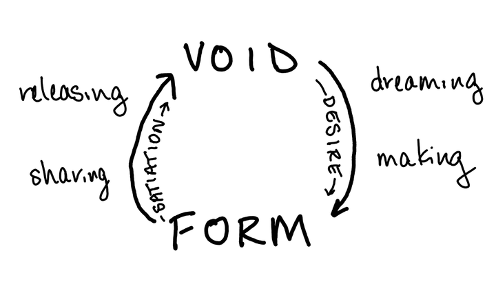
Are templates running our creative lives?
We need to talk about templates.
These days, if you'd like to communicate an idea to another person, other than perhaps in casual conversation, there's a template for you.
There's a Powerpoint template. There's an Instagram template. There's a website template. There's a meeting agenda template and a workshop template and a resume template. There's a book template. There's a template for your email header and your website footer and your Facebook banner.
I don't mean to knock on templates.
But we need to stop and ask: What does it mean that the aesthetics and formats through which we express ourselves and communicate our ideas are increasingly mediated through what other people--and, really, corporations--have told us is an appropriate, professional, attractive, or effective way to express our ideas?
Sure, we're not all graphic designers. We might not have the time or interest to spend all day picking colors or organizing a layout.
That's fine.
But there's a trade-off.
Before switching over to my current email provider, Buttondown (love it!), I briefly tried a different well-known email service that had lots and lots of landing page templates. The templates weren't possible to modify, so suddenly I was investing my time in choosing images to fill spaces I wouldn't have really wanted to have in the first place, and shortening the text so it didn't look weird in the space provided.
I used to use a well-known web hosting service that provided numerous templates for any kind of website. I always started with one of their templates, then tried to find the right images that would somehow both express me and fit in the space provided. I wrote subheadings where the template had space for a subheading, even if I wouldn't have added one otherwise. My websites never looked as good as the original template, nor did they quite feel like me. It did always feel like an inferior copy of the original template, more than a unique expression of my own.
Templates actually do shape us, much more than we think.
The amount of space for text on a slide or web template impacts how much text we think is appropriate to put there, even if we try to adapt it.
Templates that emphasize color and image can lead us to spend our time selecting colors and images, even if we might have actually preferred a plainer appearance.
I have spent countless hours adapting my own "content" to fit templates--mostly web templates and email templates, the use of which appears to be almost obligatory these days for a writer with a public presence--hours which, it now occurs to me, I might have spent developing some basic knowledge of color theory, typography, and coding to end up with something that feels like my own unique expression.
(I'm working on this now. My website-in-progress looks a bit weird, but it feels like me-weird instead of failed-to-adapt-the-template weird.)
The visual presentation of our words shapes our and others' experiences of those words, whether we like it or not.
Who gets to tell us what the visual presentation of our words should look like?
How do we make these decisions?
Especially for those of us who perhaps don't consider ourselves gifted in the area of visual art and design, how do we cultivate our ability to discern and trust our decisions about the visual aspect of presenting our writing?
I think part of this has to do with seeing the decisions that go into the templates that are available to us, and then asking, what else could there be?
Do you remember what the internet used to look like, maybe 20 years ago? When it was normal for people to put up their own sites that had chaotically patterned backgrounds and flashing text and little embedded music players? It's not that I'd like to go back to that time, it's that I'd like to remember that one could.
I'm beginning to see all the little ways that I can reshape parts of my digital world to my own liking. I pay attention to choosing what font, styles, and appearance I prefer to see in my writing program. (I currently use Obsidian, by the way. Highly recommend!) I made a Powerpoint template for my own use, reflecting my own preferences around color, headings, and text size.
I want the tools I use when I write and express my ideas to work for me--I don't want to always be doing the work to fit my ideas into them. I want to see the small opportunities to develop and trust my own aesthetic sense about how to present my writing and ideas.
Knowing what we want the visual expression of our writing and ideas to look like is a skill. Like any skill, it can be practiced.
We can start by adjusting small defaults--changing our default fonts, changing our heading colors. We can start by observing what we like and what we don't like. We can start by seeing what potential options are missing from the available templates presented to us.
I don't hate templates. I just want to think more carefully about the visual options presented to us, and how they shape what we present to the world.
The etymologic precursor to template is "templet," a weaver's stretcher. In the same way, if today's templates are providing the shape in which we weave how we present our ideas and creative work, let's think carefully about which ones are available to us, which other options we have, and what options might be missing.